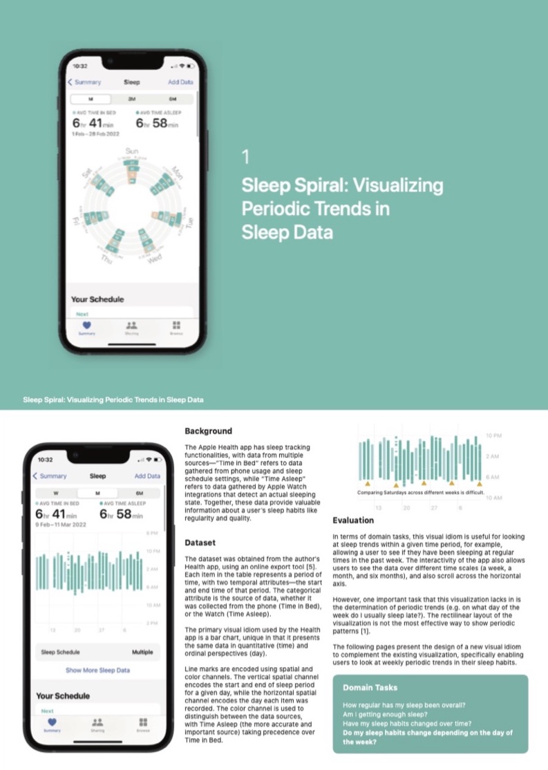
Sleep is often the subject of many visualisations aimed at helping individual users understand their health data. This comes as no surprise, given the simplicity of indirectly inferring sleep timings based on smartphone usage, with smartwatch integrations providing even more accurate and fine-grained data. The fact that we (hopefully) sleep daily means that we quickly have a huge data set to work with.
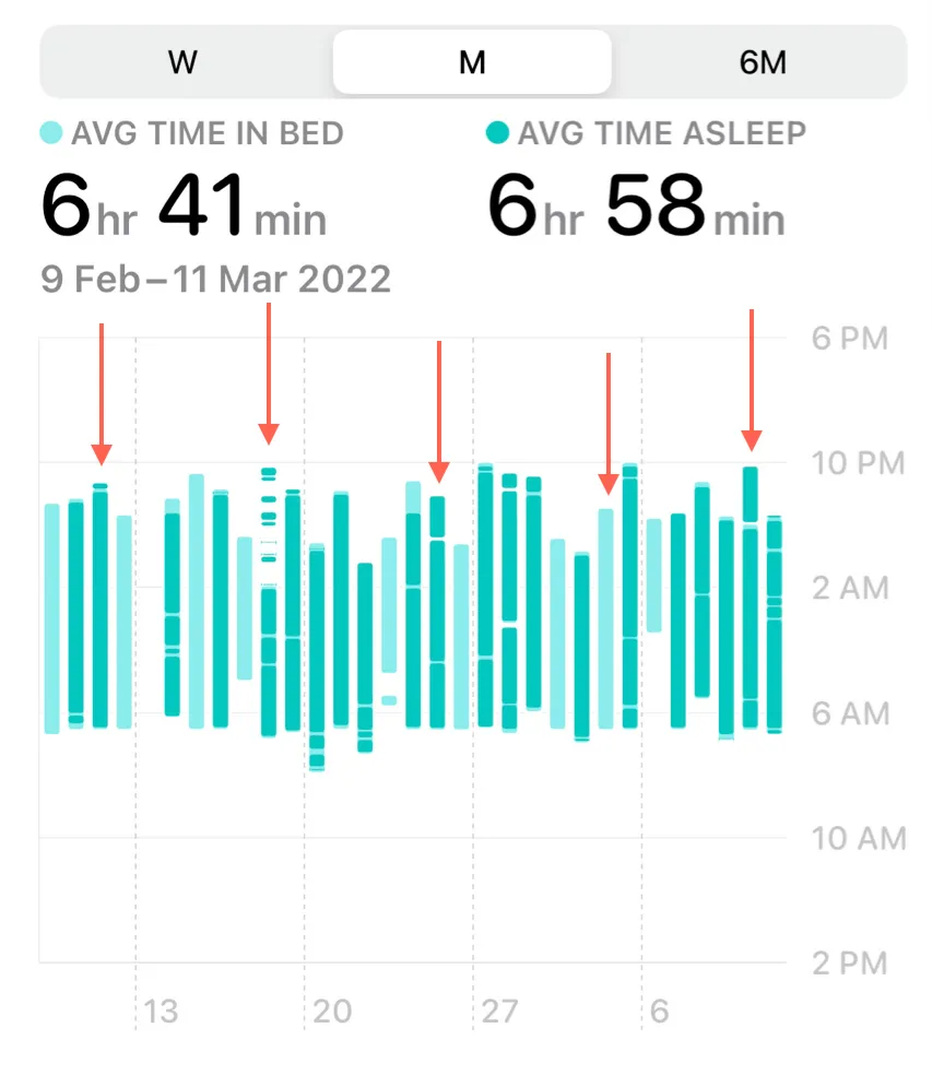
Unfortunately, most sleep tracking charts don’t take full advantage of these huge data sets. As of iOS 15, for example, Apple Health visualises its sleep data as a modified bar chart, with toggles to average periods of sleep over different time scales. This is a decent visual idiom to provide a summary of the linear history of sleep patterns – for example, seeing trends over the past week, or comparing sleep periods between different months. However, they miss out on a key aspect of the nature of sleep data: its periodicity.

Our internal clock creates a circadian rhythm, and our sleep patterns ideally follow a fairly regular 24-hour cycle. Life (as it often does) gets in the way of this regularity, which is why we may rely on sleep charts to tell us how much, and how consistently, we have been sleeping. The problem with linear charts is that they don’t adequately capture the periodic nature of sleep trends; they can tell you how much you slept last Friday, but they can’t tell you how much you generally sleep on Friday nights. And yet, knowing that our sleep quality has been consistently affected on a specific day is often the information we need to make a change; you could have just stayed up late that Friday night, but if you’ve been sleeping late every Friday night, perhaps it’s time to see if you’re suffering from revenge bedtime procrastination.
Spiral charts
Being able to determine periodic trends from data is no easy task; within a bar chart, you’d have to somehow focus on data points at specific intervals to discover some sort of pattern.
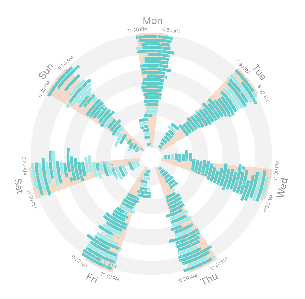
Rectilinear layouts like a bar chart aren’t quite suited for this, but radial layouts are. They allow data points to wrap around a circle, giving the viewer a new dimension to look for patterns. In the context of time series data, this is useful for arranging data into the natural, regular cycles of time, whether on the scale of minutes, days, or even years. For sleep data, a radial layout would be perfect for showing weekly periodic trends. Not to mention that radial layouts generally fit a large amount of data better in the limited screen space of a smartphone, which would be useful for presenting data over longer time scales without any need for aggregation.

Building a spiral chart
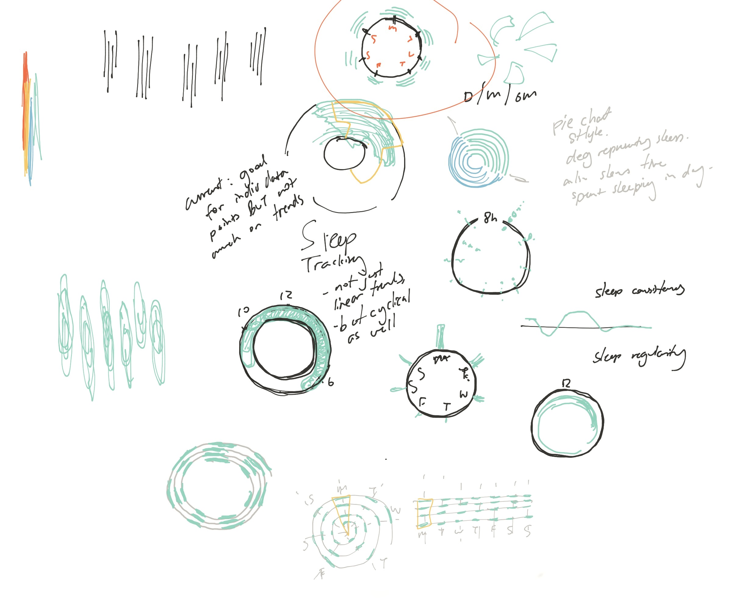
I did some initial prototyping in R, with a real data set to ensure that the visualisation would work in a real-life context. A lot of the iterative process focused on continuously evaluating elements of the design and how they contribute to the overall goal of showing periodic trends.
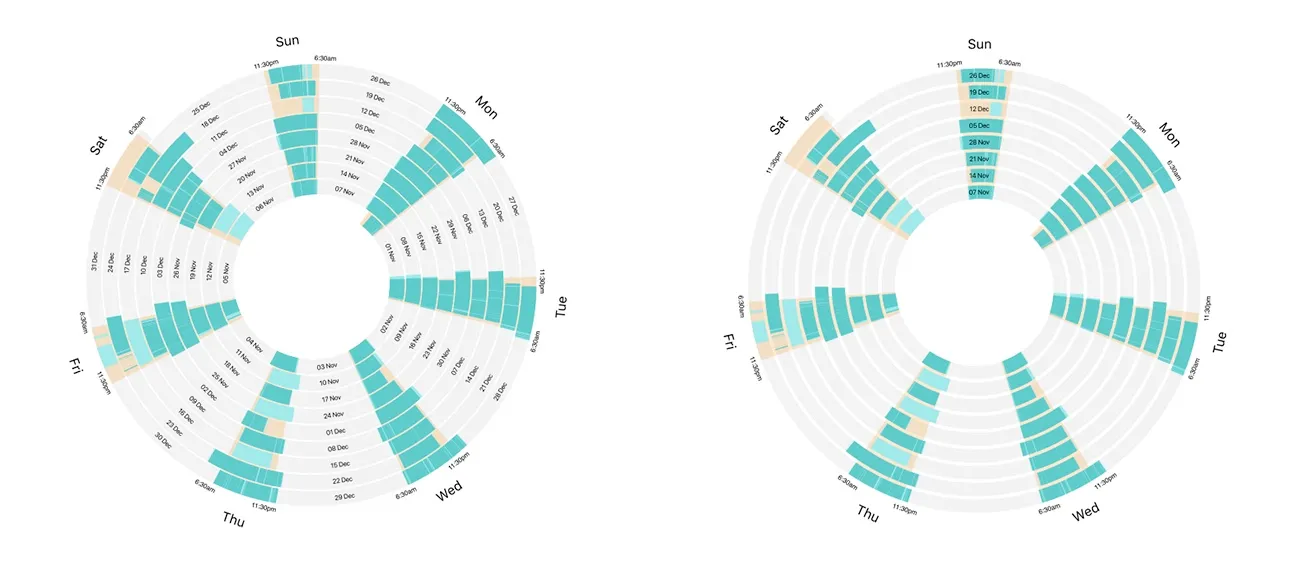
Highlighting regular slices of the circle on the chart also helped with seeing how sleep timings varied from a fixed frame of reference – in this case, a target sleep schedule of 11:30 pm – 6:30 am.
This process also brought up some weaknesses of the spiral layout, though. In particular, as more and more spirals are added, the coloured segments become less effective at comparing sleep durations between different days. This is a similar issue faced by the infamous pie chart, which required designing some elements of interactivity to work around.
Adding interactivity
Interactivity is a powerful tool for data visualisation, allowing users to directly manipulate the dataset and understand the data better through exploratory learning. Since the now-named Sleep Spiral was designed as part of the Apple Health app, capitalising on the interactivity of the smartphone interface was an important part of making the data more understandable and explorable.
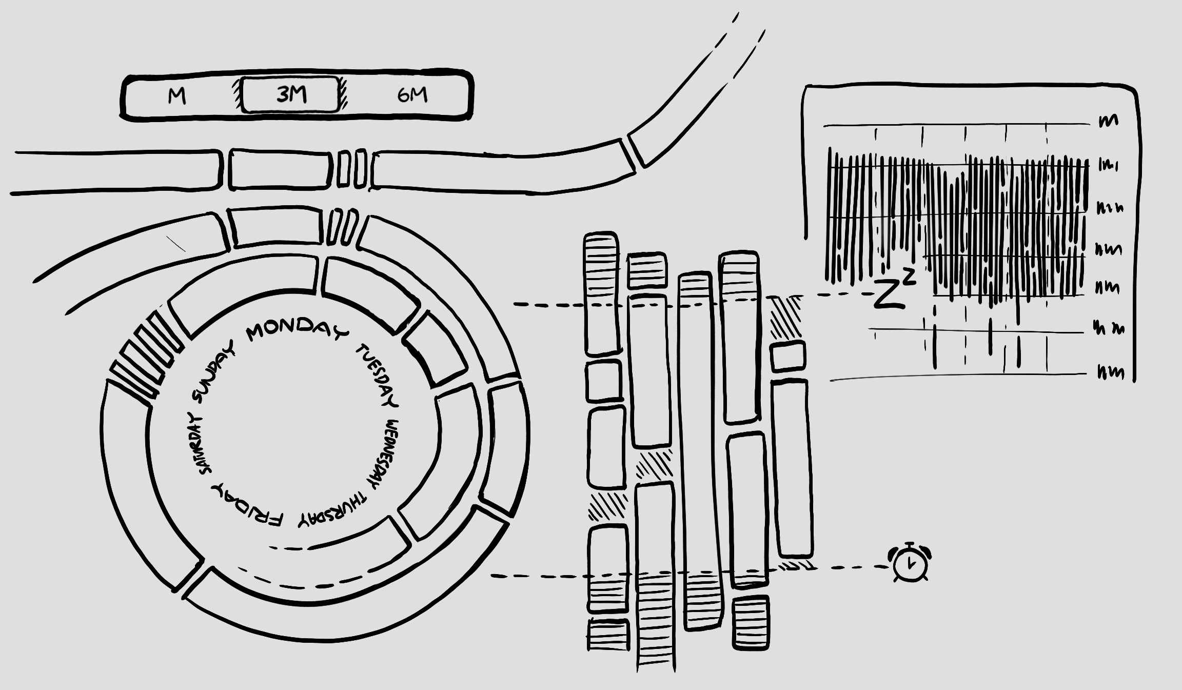
Firstly, this interactive element was incorporated into controls for timescales. To observe larger trends in sleep habits, users can view data over a larger period in the spiral. This has the visual effect of adding more rings to the spiral, which preserves the visual consistency of the chart. In this example, the sleep irregularity of the weekends can be seen, as well as a big shift in sleep hours due to a timezone change from September to October, and a trend towards late nights in January.
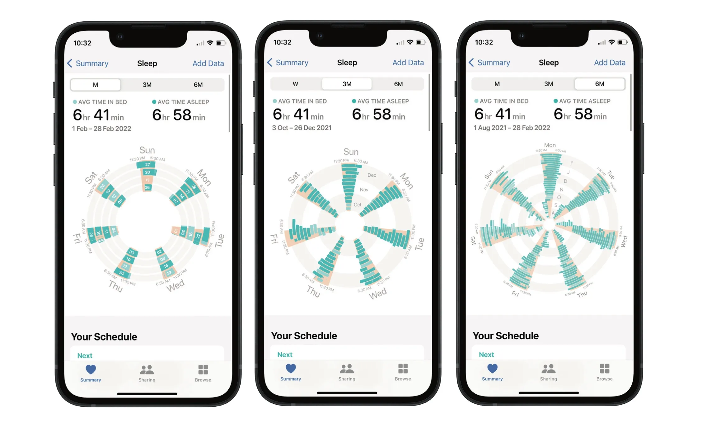
Another promising area for interactivity was in navigation – dragging on the spiral through different date ranges, which adds and removes rings on the spiral accordingly. This not only enables users to look at specific subsets of the time series data but also allowed them to bring certain weeks of interest into the outer rings for easier comparison, which helps offset the difficulty of comparing data within the inner rings. Directly manipulating the chart in this way, as opposed to a button or tab trigger, increases the likelihood of learning via exploration of the data.

Finally, tapping a segment on the spiral zooms into the specific weekday, animating into a rectilinear layout. The arc of the spiral ‘straightens’ to make comparison across weeks easier, effectively bypassing the weakness of the angle encoding (as a slice of a circle) by transforming it into a length-based one i.e. a regular bar chart. The user is then able to swipe through a carousel to see each day of the week or tap back out into the spiral view.

Final Thoughts
Overall, presenting sleep data in a spiral chart adds a new perspective towards the rich data collected by the Health app, allowing users to look at cyclical trends of weekdays over different periods.
As an exercise in user-centred data visualisation, it shows how the usage context of a smartphone creates opportunities for interactivity to make up for the weaknesses present in a static visualisation, strengthening the discoverability and usability of a chart by facilitating exploratory learning.